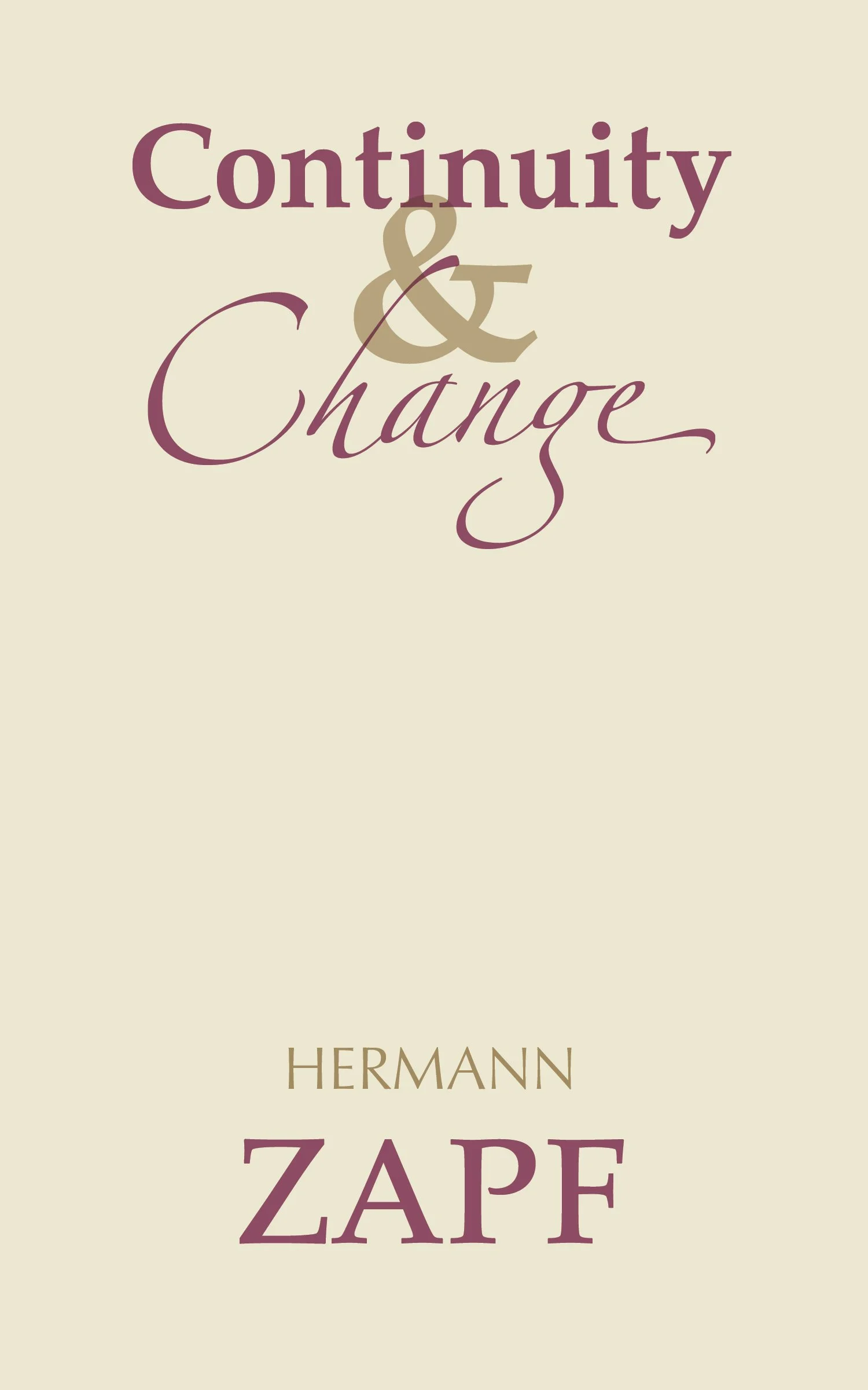
Continuity & Change
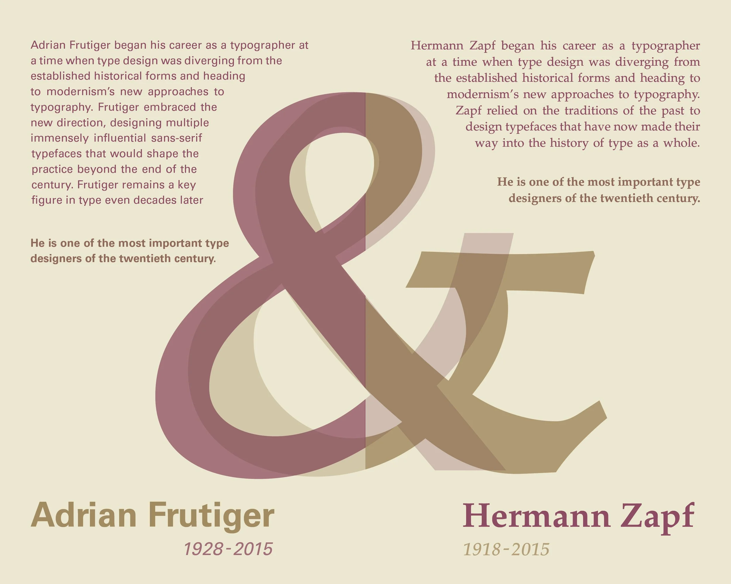
This book compares two of the 20th century’s most celebrated type designers, Adrian Frutiger and Hermann Zapf. It highlights both the constants and the things that set them apart from each other as well as the other designers of the period. The book was made with risograph printing in mind — risograph printers produce an effect similar to that of screen printing, laying down one color of ink at a time — so it incorporates a two-color design as well as a wide range of opacities. Specific choices show the differences in the two designers’ practices, such as the page layout and typography. All writing is done by myself and makes use of a reflective narrative structure that is echoed in the design.